So, a couple of weeks ago, Richard from Collecting Blue Jays sent me this massive box filled with want list needs and tough to find regional issues. All out of the kindness of his heart. And because he's trying to make room for his growing Joe Carter collection. I suppose the word in the blogosphere right now is 'focus'. Here's a tiny sample of the almost 600 cards that were sent my way !
This is a mustache fest !
Batting cage galore ! (how Fleer stayed in business is really a mystery, when you look at their first sets)
As someone who started by collecting basketball cards, I'm very happy to add those two gems to my collection.
The usual GQ & A&G (though that 2011 GQ design and 2008 A&G were new to me)
Hard to let go of a winning concept...
My favorite Bowman design. Which doesn't say much, I agree, but this one is really great.
Man I love those !
More oddballs from Toronto's best years
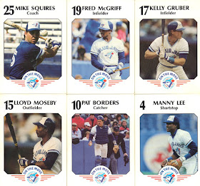
There're oddballs...and then there're oddballs. And you can't beat the set put out each year by the Fire association of Toronto. I'm saying this with all the love I have for them (the cards, not the firemen, as I don't know them personally. But I'm sure they're great people), but those have to be some of the worst cards ever produced. Terrible photography, lackluster design, hardly any stat whatsoever and thin cardboard stock. But hey, there's something about them that makes them lovable. I just hope they don't spend too much time putting those together...
1984 :
the focus of this set was to make everything possible so we wouldn't see the faces.
One of the worst use of horizontal photography
1985 :
They realized that outside shots wasn't the way to go, so they hired a photographer to take studio shots. Why not. They do look larger than life (especially Dennis Lamp's mustache) that way. Maybe this is what inspired the whole Studio line.
1986 :
To celebrate the 10th anniversary of the franchise, they decided to be bold and put out the exact same set as the year before.
1987 :
White borders ! Crazy kids
1989 :
Back to the great outdoors, and game photos. Curious to see that the best one is actually of a coach.
1991 :
1994 :
World series back to back ! the card stock is decent and so are the photos (kind of). I don't know how you call that caption where the names appear, but that's some straight up 90s stuff for you. Horrible.
1998 :
Fast forward to 98. The avent of high end cards, shiny stuff everywhere, super thick card stock...and then there's this. At least, there's the official catch phrase.
1999 :
They almost got this one right. Except for the fact it's a pain trying to read the names and that I don't really understand what they mean by 'Get in the game'.
2 000
In 2 000, they simply gave up. Too much pressure, I suppose. So back to terrible blurry photography (or maybe it's just the impression that's bad) and thin cardboard stock. Ah well. They had a good run. And at least, there're mascot cards in there.
So there you go. I made a lot of fun of some of those, but I do appreciate having them in my collection, that wouldn't be complete without them ! Thanks a lot, Richard, for taking the time to look at my wantlist and for thinking of me when you cleaned out your shelves. I need to try to find some very special Joe Carters for you !


So many great oddballs!
ReplyDeleteYou have to love oddballs. Those are simply amazing. The Ainge cards are nice too. I've thought about getting one of his cards, but still haven't.
ReplyDeleteyou can't beat badly printed mustaches !
DeleteWow - lots of awesome stuff there!
ReplyDeleteI've said it before, I'll say it again...oddballs rule!
ReplyDeleteyou've made some fantastic friends Kevin. The love shows!
ReplyDelete